How to Read Candlestick Charts: The Beginner's Guide to Market Sentiment
Discover how to read candlestick charts to decode buyer and seller psychology in real time. Read the full guide.
By Trader Faculty Team
Direct Answer
A candlestick chart is a visual tool that maps asset price movements by tracking the open, high, low, and close levels for a specific timeframe. By analyzing the relationship between the candle's real body and its wicks, traders can instantly determine whether buyers or sellers are driving market momentum.
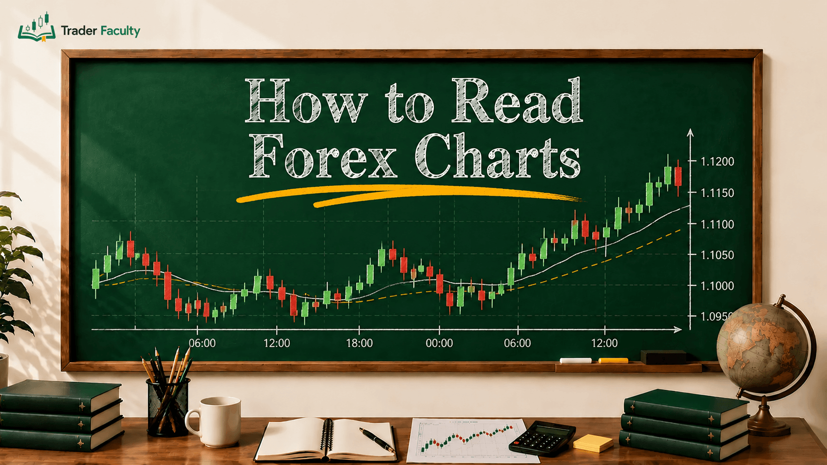
A candlestick chart is a visual financial chart that displays the high, low, open, and close prices of an asset for a specific timeframe. It provides a clean, two-dimensional snapshot of price action that helps you track market momentum at a glance.
If you have ever opened a charting platform and felt instantly overwhelmed by the sea of red and green bars, you are not alone. Most beginners treat chart reading like a memory test, trying to memorize dozens of exotic-sounding patterns without understanding what they actually mean. This guide shifts your approach from blind memorization to actual chart reading. You will learn the exact mechanics behind how candles form, how to decipher the hidden psychology of buyers and sellers, and how to spot structural traps that cost untrained traders real money.
Quick Takeaways
- Candlesticks map the psychological battle between buyers and sellers in real time, offering far more data than a standard line chart.
- The relationship between the candle body and its wicks tells you who controlled the session and whether that control is fading.
- A candlestick pattern is virtually meaningless without structural context like key support and resistance levels.
- False signals are a natural part of trading, making volume confirmation and risk management mandatory for every setup.
What Is a Candlestick Chart?
A candlestick chart is a data visualization method used in technical analysis to plot price movements across assets like stocks, forex, crypto, and commodities. Unlike a basic line chart that only connects closing prices, a candlestick chart tracks four distinct data points within every single trading session.
This style of charting originated in the 18th century, developed by Japanese rice traders to track market momentum and emotional sentiment rather than just supply economics. Western traders were later introduced to the concept because of how efficiently it highlights trend changes. By viewing price movement as a continuous series of open and closed candles, you gain an immediate visual edge in spotting who is currently winning the tug-of-war between supply and demand.
How Candlesticks Work: The Anatomy of Price Action
Every candlestick tells a story about a specific window of time, whether you are looking at a 5-minute chart or a monthly view. To read this story clearly, you need to break down the candle into its three fundamental structural components.

The Real Body
The wide, rectangular center of the candle is called the real body. This block represents the exact price range between the session's opening price and its closing price. The length of the body indicates the relative strength of the market momentum. A long body shows heavy conviction from whichever side won the session, while a tiny, compressed body signals that neither buyers nor sellers could move the needle significantly.
Wicks and Shadows
The thin lines extending above and below the real body are known as wicks, tails, or shadows. The highest point of the upper wick shows the absolute maximum price reached during the session. The lowest point of the lower wick represents the absolute minimum price. These lines are crucial because they show you exactly where the market tried to go, but was ultimately pushed back before the session ended.
The Color Framework
The color of the real body tells you the direction of the price movement during that specific interval.
- Bullish Candlestick (Typically Green or White): A candle is green when the closing price is higher than the opening price. It tells you that buyers successfully drove the market upward during the session. For a deeper look at these setups, see our guide to bullish candlestick patterns.
- Bearish Candlestick (Typically Red or Black): A candle turns red when the closing price finishes below the opening price. This informs you that sellers controlled the session and dragged prices down.
Why Candlestick Charts Matter for Traders
Candlestick charts matter because they expose the underlying auction dynamics of the financial markets in plain view. Think of a chart not as a static line of data, but as a live battleground. Every asset price moves based on imbalances between buy orders and sell orders.
When you look at a line chart, you only see the final destination of a trend. A candlestick chart shows you the struggle it took to get there. For instance, if an asset goes up during the day but leaves behind a massive upper wick, the candlestick warns you that sellers stepped in at the highs to block further progress. This type of real-time supply and demand insight allows you to spot potential turnarounds long before they register on lagging mathematical indicators.
Key Candlestick Formations: Sentiment Archetypes
Traders classify candles into single-candle structures and multi-candle combinations to identify shifts in market psychology. Rather than memorizing their names as rules, look at how the bodies and wicks interact.
| Pattern Category | Common Examples | Market Sentiment Implication |
|---|---|---|
| Indecision & Balance | doji candle, spinning top candlestick | Complete equilibrium; buyers and sellers are deadlocked. |
| Reversal & Rejection | hammer candlestick, shooting star candlestick, engulfing candle, hanging man candlestick | A major structural counter-attack; old momentum is exhausted. |
| Grouped Momentum | three white soldiers, morning star pattern, evening star pattern, bullish harami, bearish harami, piercing line candlestick pattern | Structural handoff of control across multiple sessions. |
Indecision and Neutrality
When a session opens and closes at almost the exact same price, it forms a doji candle. The real body collapses into a thin horizontal line. This means that despite aggressive volatility throughout the timeframe, neither side could maintain an advantage. One common variant, the dragonfly doji, forms when sellers push price down during the session but buyers fully recover it by the close, leaving a long lower wick and almost no upper wick.
Similarly, a spinning top candlestick features a small body wrapped by long wicks on both sides. This signals an open struggle where both buyers and sellers attempted to push the market around but ended up settling back near the middle.
Reversal Signals
Reversal candles showcase a violent rejection of price and are often grouped together as reversal candlestick patterns because each one signals a potential change in trend direction. For example, a hammer candlestick forms at the bottom of a downward move, featuring a tiny body at the top and a long lower wick. This tells you that sellers tried to crush the price, but buyers stepped in with immense force to snap it back up before the close. Price action traders often call this entire family of long-wick rejection candles a pin bar candlestick, regardless of which side of the trend it appears on. If that identical shape appears at the peak of an uptrend, it is called a hanging man candlestick, hinting that selling pressure is beginning to build beneath the surface.
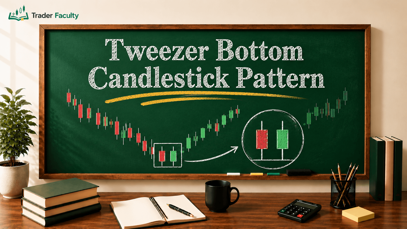
Conversely, a shooting star candlestick shows up at the top of an upward move with a long upper wick, showing that the market forcefully rejected higher prices. When a massive candle completely swallows the previous session's body, you are looking at an engulfing candle, which indicates a sudden, aggressive shift in market control. You can also spot structural shifts across multiple sessions through formations like a piercing line candlestick pattern, where buyers claw back more than half of a previous bearish candle's losses.
Continuation Dynamics
Sometimes, candles show that a trend is healthy and accelerating. A wide candle with zero wicks is known as a marubozu candle. This shows total domination from open to close, with buyers or sellers pressing their advantage every minute of the session. When you see three consecutive long green candles with minimal wicks, known as three white soldiers, it confirms that institutional capital is heavily driving a trend forward.
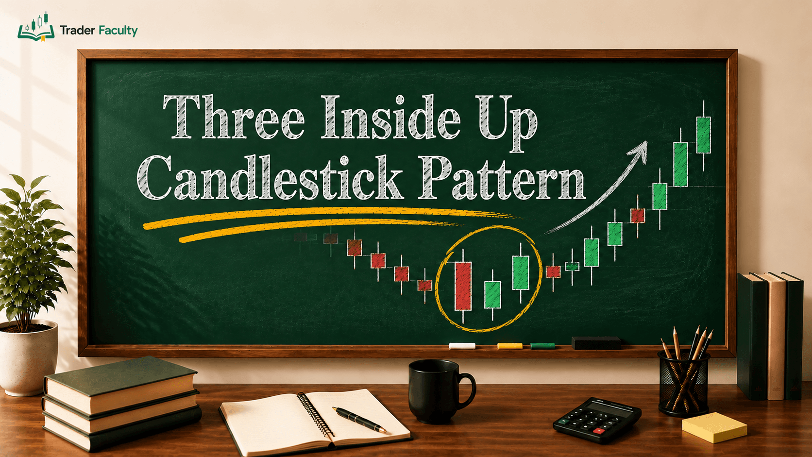
Multi-session clusters can also flag major inflection zones. A dark bearish candle followed by a compressed gap candle and a strong green candle forms a morning star pattern, showing a controlled transition from selling to buying. The mirror image at market peaks is an evening star pattern, warning of an impending downturn. More subtle shifts look like a bullish harami or a bearish harami, where a small inside candle forms entirely within the belly of a massive predecessor, hinting that the prevailing trend is running out of steam.
Common Mistakes and Deceptions in Candle Trading
Reading candles effectively requires knowing when they are lying to you. Because these structures are highly visual, they can easily turn into cognitive traps for undisciplined eyes.
- Trading Patterns in Complete Isolation: A hammer candle built right in the dead center of a messy, sideways trading range means nothing. It is simply random noise. That same hammer forming exactly at a historical support level is a high-probability zone. Context dictates validity.
- Ignoring Volume Confirmation: A massive breakout candle that forms on low trading volume is an open trap. If large institutions are not backing the move with real capital, the candle is highly prone to collapsing into a false breakout.
- Failing to Recognize Low-Liquidity Distortions: In illiquid markets or during off-market hours, small order sizes can cause massive, erratic wicks. These structural distortions do not reflect real psychological rejections; they are simply the result of wide bid-ask spreads.
- Skipping Risk Management Controls: No candlestick formation guarantees future performance. Assuming that a textbook reversal pattern is foolproof is the fastest way to blow an account. Always use hard stop-losses positioned defensively beyond the structural wicks to protect your capital when a pattern completely fails.
Conclusion
Learning to read candlestick charts gives you a direct window into the live psychological state of the financial markets. By moving away from rigid flashcard memorization and focusing on the relationship between the real body, wicks, and structural context, you can read price charts with genuine clarity. If you find standard charting too noisy, exploring alternative visualization methods like Heikin-Ashi charts can help smooth out the core trend. Remember that individual candles are simply letters; you must read the entire chart sentence to understand the structural story.
Frequently Asked Questions
How do you read a candlestick chart for beginners?
Beginners should start by looking at a candle's color to see direction—green means the price went up, red means it fell. Next, examine the real body to gauge momentum strength, and check the wicks to see how heavily the market rejected higher or lower extremes during that timeframe.
What do the wicks on a candlestick mean?
Wicks, or shadows, represent the highest and lowest prices reached during a trading session that the market failed to sustain. A long upper wick highlights that buyers pushed the price up but encountered strong resistance from sellers, while a long lower wick shows aggressive rejection of lower prices by buyers.
What is the most reliable candlestick pattern?
No individual candlestick pattern is completely foolproof in isolation. The reliability of any formation increases significantly when it occurs at major technical structural zones, such as historical support or resistance levels, and is backed by high trading volume to confirm institutional activity.
How do you know if a candlestick is bullish or bearish?
You can instantly tell a candle's nature by checking its relationship between the open and close prices, typically shown by color. A bullish candle occurs when the close is higher than the open, usually colored green or white. A bearish candle finishes with a close below the open, colored red or black.
Are candlestick charts accurate?
Candlestick charts are highly accurate for displaying historical data, but they do not predict future movements with absolute certainty. They plot precise open, high, low, and close prices, helping you map current probabilities and market sentiment rather than providing guaranteed trade outcomes.
Keep learning
TA Masterclass
Reading charts one article at a time? Get the full method, in order.
10 lessons quiz
Start TA MasterclassThe Trader Faculty Team writes and reviews every guide together — pairing hands-on market experience with a curriculum-first approach to trading education. One good syllabus, taught in the order that makes you better.