What Is a Stock Heat Map? A Visual Scanning Guide
Learn what a stock heatmap is, how to read tile colors and sizes, and how to spot trading opportunities. Read the full guide.
By Trader Faculty Team
Direct Answer
A stock heat map is a visual market screener that displays financial performance across assets, sectors, or indexes using a color-coded grid. Tile colors represent price movement and percentage change, while tile sizes reflect market capitalization or index weighting. Traders use heat maps to gauge overall market sentiment and spot sector rotation in real time.
Scanning dense financial tables with hundreds of ticker symbols creates unnecessary mental fatigue when you want a quick market overview. Standard price lists force you to read raw numbers row by row, making it difficult to spot momentum across broad market sectors.
If you’re wondering what a stock heat map is, think of it as a visual scanning dashboard that solves this friction by converting live price feeds into intuitive color grids. This guide explains how to interpret tile dimensions, spot sector rotation, and use a market heatmap to find quality trading opportunities — it’s easier than it sounds.
Quick Takeaways
- A market heatmap organizes assets into size-adjusted tiles so you can evaluate broad market performance at a single glance.
- Tile sizes reflect market capitalization or index weighting, while color intensity displays the magnitude of price shifts.
- Instant visual feedback helps you see capital flowing between growth and defensive sectors throughout the trading session.
- Visual momentum identifies potential trade setups, but you must confirm entries with technical chart setups before taking risk.
What Is a Stock Heat Map?
A stock heatmap, often built as a nested treemap, is a visualization tool that maps financial data using geometry and dynamic color spectrums. Instead of sorting tickers into endless text lines, it groups individual assets into visual blocks organized by sector, such as Technology, Financials, or Energy.
Many screeners function as a visual heat chart that translates numerical changes into graphic properties. You can easily access these tools on modern charting platforms like TradingView or through various free stock heat map tools online.

Every heat map visualizes data through three primary dimensions:
- Tile Size: The physical size of a stock's rectangle typically corresponds to its market capitalization (the total dollar value of its outstanding shares) or its relative weighting within an index like the S&P 500.
- Tile Color: Color indicates the direction of price movement. Green generally represents positive performance, while red signals negative performance.
- Color Intensity: The brightness or shade of the color reflects the magnitude of the price shift. A deep, bright green indicates a large percentage gain, whereas a muted, dark green reflects a modest change.
How a Stock Heat Map Works
Visual screeners process continuous price data from exchange networks, converting raw percentages into clear visual tiers. As price updates arrive, tile shading adjusts automatically to reflect real-time shifts.
| Visual Indicator | Market Movement | Typical Price Change Range |
|---|---|---|
| Bright Green | Strong Gain | +3.00% or higher |
| Muted / Dark Green | Moderate Gain | +0.01% to +1.00% |
| Gray / Dark Neutral | Flat / Unchanged | 0.00% |
| Muted / Dark Red | Moderate Loss | -0.01% to -1.00% |
| Bright Red | Strong Loss | -3.00% or lower |
Understanding how these properties interact lets you evaluate market health without reading individual numbers:
- Index Weighting: Mega-cap equities occupy the largest visual blocks because their price shifts drive broad market indexes.
- Sector Grouping: Related companies sit together, showing you whether price action impacts an entire industry or single tickers.
- Data Speed: Free web platforms often display market feeds with a 15-minute delay, while real-time trading terminals update continuously.
Performance Maps vs. Order Book Heat Maps
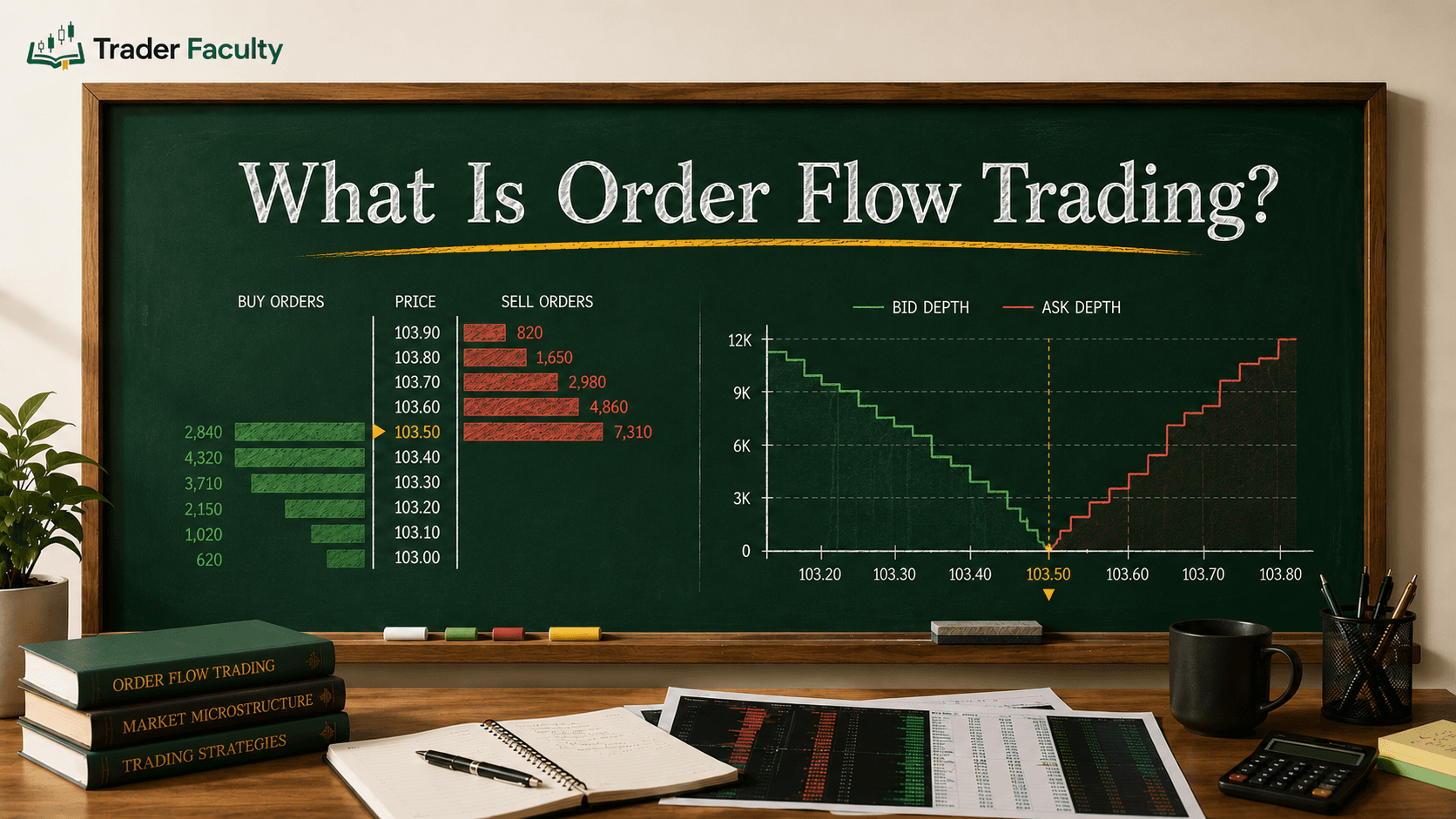
Traders often use the term heatmap stocks to refer to two distinct visual trading tools: daily performance heat maps and liquidity depth heat maps.
| Feature | Performance Heat Maps (Treemaps) | Order Book Liquidity Heat Maps |
|---|---|---|
| Primary Data | Percentage price change over time | Depth of Market (DOM) / Level 2 limit orders |
| Visual Structure | 2D rectangular grid grouped by sector | Historical price chart overlaid with color bands |
| Primary Use | Sector scanning and macro market overview | Identifying buy/sell walls and market microstructure |
| Target Trader | Swing traders, macro traders, investors | Day traders, scalpers, order flow traders |
Performance heatmaps show historical context over selected timeframes like 1 day or 1 month. Order book liquidity heatmaps plot resting buy and sell orders directly on price levels, exposing hidden order book depth in real time.
How Traders Use Stock Heat Maps to Spot Opportunities
Using a visual screener turns broad market analysis into a clear four-step process for finding trade ideas:
- Assess Overall Market Breadth: Open a broad market grid at the start of the session. If most tiles glow bright green, market participation is strong and buyers hold control.
- Identify Sector Rotation: Watch for capital shifts between aggressive and defensive sectors. If tech tiles turn red while energy tiles brighten, capital is actively rotating into energy.
- Locate Outlier Tickers: Search for green tiles inside an otherwise red sector. A stock showing positive performance during widespread selling demonstrates relative strength.
- Formulate Trade Hypotheses: Use visual screeners to narrow thousands of stocks down to a small watchlist of candidates for detailed chart analysis. Test your strategy in a demo account before executing live positions.
Real-time exchange data feeds are regulated under disclosures by authorities such as the U.S. Securities and Exchange Commission.
Common Beginner Pitfalls in Heatmap Trading
While visual tools speed up your market review, relying on visual cues without systematic rules creates hidden risks:
- Chasing Visual Momentum: Intense green tiles attract attention, encouraging emotional purchases after the main price move has already expanded.
- Ignoring Feed Latency: Placing quick intraday orders based on delayed visual screeners causes poor fill prices and execution mismatch.
- Replacing Technical Analysis: Visual grids show current price changes, but they cannot project key support or resistance levels.
To avoid these traps, pair visual screeners with specialized software featured on the best day trading platforms to confirm your technical setups.
Conclusion
Now that you know what a stock heat map is, you can see how it transforms complex market data into an accessible visual grid that saves scanning time. By organizing assets by market cap and price change, these tools help you spot sector rotation and market breadth in seconds.
Remember that visual screeners highlight market activity but don’t generate standalone execution signals. Always combine visual scanning with disciplined technical analysis, clear risk controls, and reliable trading tools to protect your capital. Trading financial markets carries a risk of loss, so evaluate your financial situation before placing trades.
Frequently Asked Questions
What does green and red mean on a stock heat map?
Green indicates a positive price change, showing that a stock or sector has gained value over the selected timeframe. Red indicates a negative price change, showing a decline. Brighter or more intense shades signal larger percentage movements, while darker or muted shades represent smaller price shifts.
What is the difference between a stock heat map and a stock screener?
A traditional stock screener uses text filters and custom criteria to filter stocks into a list format based on specific parameters like valuation or volume. A stock heat map visualizes the entire market simultaneously using graphic tiles, color intensity, and area sizes to convey market breadth and sector strength instantly.
How do you read block sizes on a stock market heatmap?
Block sizes on a stock heat map generally represent market capitalization or weighting within a benchmark index. Mega-cap companies occupy larger rectangular tiles because they exert a greater influence on market direction, whereas small-cap equities occupy smaller tiles within their respective sector blocks.
What are heatmap stocks used for in day trading?
Day traders use heatmap stocks to monitor real-time sector momentum, track order book liquidity depth, and identify strong market movers at market open. By quickly scanning visual shifts, day traders spot relative strength and weakness across market sectors without reading hundreds of individual quote lines.
Are stock heat maps updated in real time?
Update frequencies depend on your platform and data subscription level. Institutional terminals and premium chart packages process heat map feeds in real time as market ticks occur. Many free public web screeners display market data with a standard 15-minute delay.
Keep learning
Setting Up Your Trading Setup
Set up your broker, platform, and demo the right way.
8 lessons quiz
Set up your toolsThe Trader Faculty Team writes and reviews every guide together — pairing hands-on market experience with a curriculum-first approach to trading education. One good syllabus, taught in the order that makes you better.